
Typography plays a powerful role in shaping the visual and emotional impact of any design. Whether it’s a brand identity, website layout, or a YouTube thumbnail—your choice of font sets the tone before a single word is read. Introducing Blauer Nue, a sophisticated sans-serif font family meticulously crafted by Webhance Studio for designers who seek clarity, elegance, and high usability across all platforms.
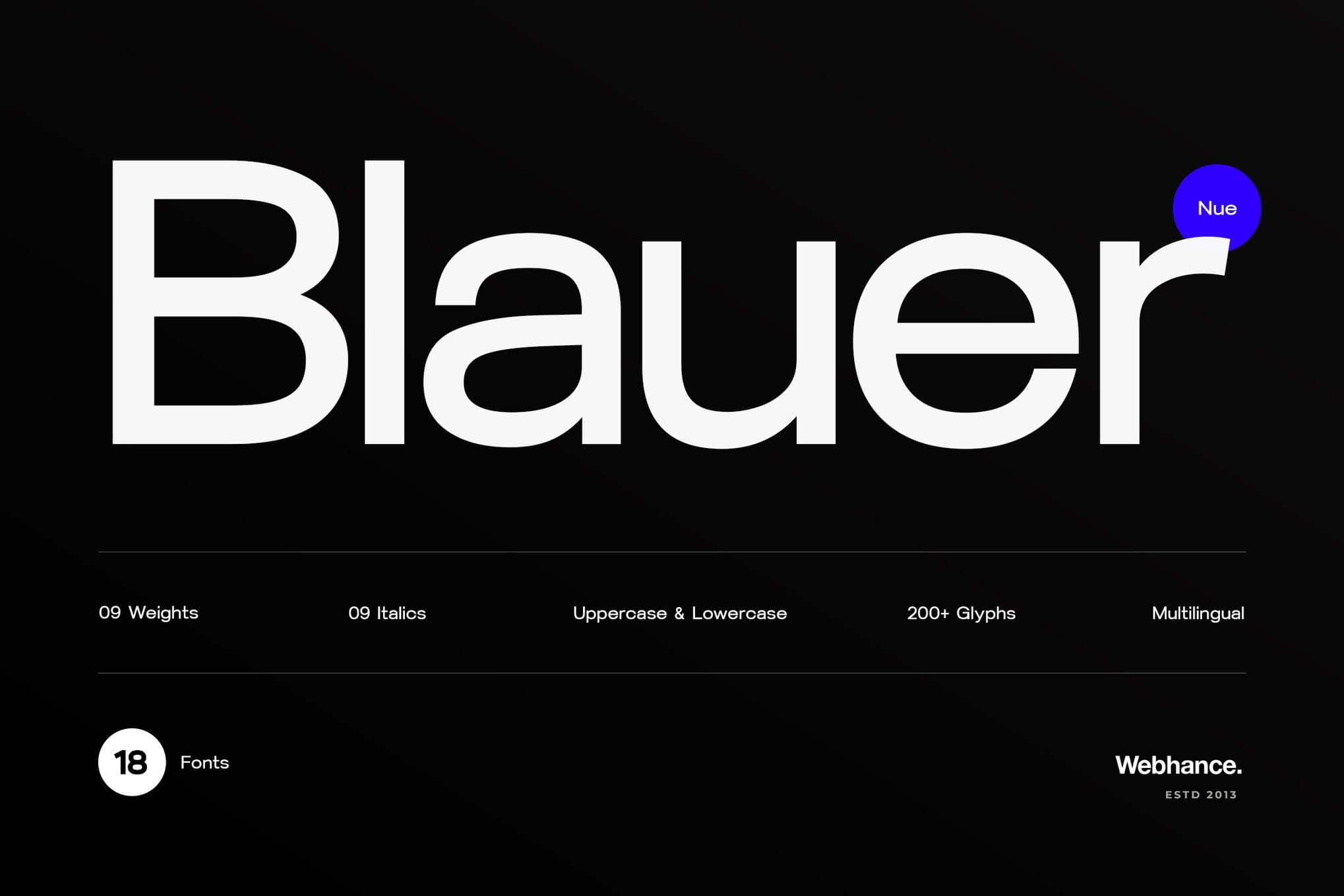
What Is Blauer Nue?
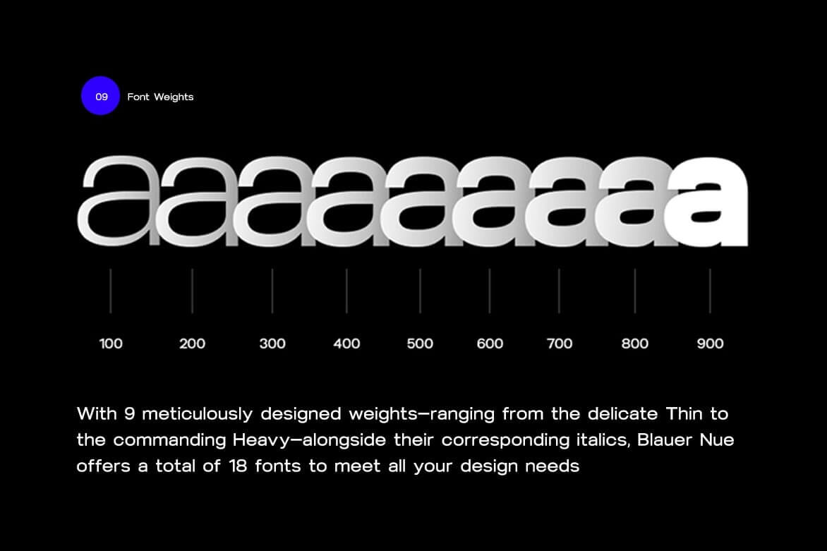
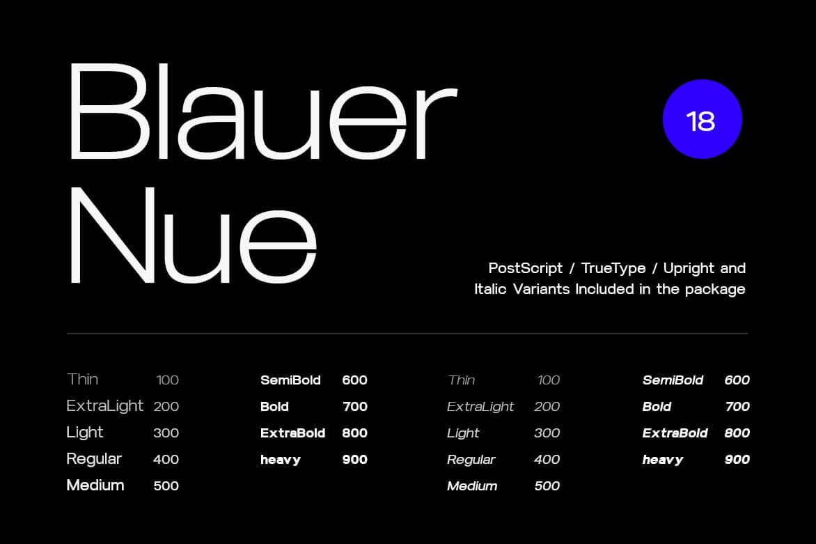
Blauer Nue is a clean, contemporary sans-serif typeface designed to work flawlessly across both print and digital environments. With 9 refined weights—from the ultra-light Thin to the bold and assertive Heavy—and matching italics for each, Blauer Nue offers a total of 18 fonts that adapt perfectly to your creative needs.
Each style is built with attention to proportion, alignment, and legibility, making it a go-to choice for:
- Branding & Logo Design
- Website UI/UX
- Social Media Graphics (Instagram posts, Reels text, YouTube thumbnails)
- Posters, Flyers & Editorial Design
- Corporate Presentations & Infographics
- Mobile App Interfaces
No matter the project, Blauer Nue ensures your content looks polished, professional, and readable.
Buy onWhat’s Inside the Package?
- 9 Font Weights + 9 Italics = 18 Fonts
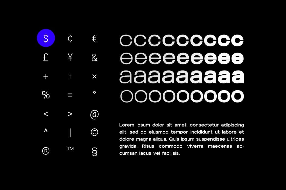
- Multilingual Support (200+ glyphs)
- Uppercase & Lowercase Letters
- Numbers & Punctuations
- OTF, TTF, EOT, WOFF Formats Included (54 files in total)
- Free Updates & Future Feature Additions
Why Typography Like Blauer Nue Matters
Studies have proven that the way we perceive information is strongly influenced by typography:
- A MIT study (2012) showed that users exposed to high-quality typography were not only more engaged but also performed better in reading comprehension tasks.
- The Google Research Team found that users judge design aesthetics in as little as 50 milliseconds. Clean, modern typography like Blauer Nue plays a key role in creating positive first impressions.
- According to the Baymard Institute, strong typography contributes directly to usability by reinforcing a clear visual hierarchy. Font weights and spacing help guide users naturally through content.
When your typography is intentional, it doesn’t just look better—it works better.
The Risks of Using Poor Typography
Fonts are not just decoration. They affect how your message is received, and poor font choices can result in:
- Visual Confusion: Inconsistent or overly decorative fonts can disrupt content flow.
- Reduced Readability: Fonts that are hard to read (especially on screens) make users leave faster.
- Loss of Trust: According to Stanford’s Web Credibility Research, 75% of users judge a business’s credibility based on its website design, and typography is a major part of that.
- Weaker Brand Identity: Bad typography makes even the best-designed logos or layouts feel unpolished.
Blauer Nue – The Perfect Choice for Clean, Confident Communication
Blauer Nue was built not just to look good—but to perform in real-world design systems. Whether you’re designing a brand identity, crafting social content, or refining user interfaces, this font family delivers consistency, flexibility, and modern flair.
Designed and crafted by Webhance Studio, Blauer Nue is a professional-grade font that empowers your design with elegance and efficiency.
If you’re looking for a typeface that adapts to your creativity, while keeping your design clean, readable, and modern—Blauer Nue is ready to be your new favorite.